Table of contents
Open Table of contents
React Design Patterns: Layout Components
What are design patterns?
While you regularly encounter unique issues as a software engineer, you can also agree that some common issues spring up in your day-to-day code. These issues mostly have to do with software design and structure.
Design patterns can be simply defined as general, repeatable and reusable solutions to commonly occurring issues in software design. Think of design patterns as tested, proven and trusted templates that guide you in writing efficient and cleaner code.
Utilizing design patterns introduces a lot of benefits to your codebase as a whole. Here are some examples of such benefits:
- eliminates subtle issues that may arise from poor design or structure of the code
- improves code readability
- ensures code maintainability
- removes unnecessary ambiguity and repetitive code
- enforces a clear and distinct separation between major concerns
etcetera
Layout Component Pattern
Introduction
The Layout Component pattern organizes your app’s user interface (UI) structure from a container scale. These types of components are concerned with how things look and how they are structured on the UI, rather than how things work.
They have just one job: arrange the children components in a particular structure and nothing else! The layout design pattern provides a consistent and reusable structure for the concerned components. This means the components do not have to know how they are being displayed, they only need to focus on their primary function.


Mechanism
A layout component acts as a parent template, it dynamically accepts any component as a child and renders them according to certain structural or organizational styles. Let’s dive into some specific examples and see how this works.
Screen Splitter Example
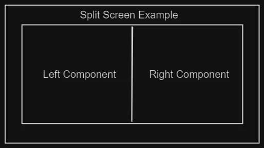
Let’s take a look at a screen-splitter component whose job it is to divide a part of the viewport into two sections or sides in a side-by-side fashion:
const SplitScreen = ({
  children,
  rightWidth = "0 0 80%",
  leftWidth = "0 0 20%",
}) => {
  const [left, right] = children;

  const layoutStyle = {
    container: {
      display: "flex",
      gap: "2rem",
      justifyContent: "center",
    },
    left: {
      flex: leftWidth,
    },
    right: {
      flex: rightWidth,
    },
  };
  return (
    <div style={layoutStyle.container}>
      <div style={layoutStyle.left}>{left}</div>
      <div style={layoutStyle.right}>{right}</div>
    </div>
  );
};

const HomePage = () => {
  const LeftSidePane = ({ title }) => {
    return <h2 style={{ color: "red" }}>{title}</h2>;
  };
  const RightSidePane = ({ title }) => {
    return <h2 style={{ color: "green" }}>{title}</h2>;
  };

  return (
    <div style={{ width: "100%" }}>
      <SplitScreen leftWidth={"0 0 80%"} rightWidth={"0 0 20%"}>
        <LeftSidePane title={"This is the left pane"} />
        <RightSidePane title={"This is the right pane"} />
      </SplitScreen>
    </div>
  );
};

export default HomePage;
We can breakdown the above snippet with further explanations for each part and how they work together to achieve desired results:
   	  <SplitScreen leftWidth={"0 0 80%"} rightWidth={"0 0 20%"}>
        <LeftSidePane title={"This is the left pane"} />
        <RightSidePane title={"This is the right pane"} />
      </SplitScreen>
The above snippet is an example of a layout component called SplitScreen, which takes in two width props, one for the left and the other for the right sections. Subsequently, it enwraps two components called <LeftSidePane /> and <RightSidePane /> as its children.
To further breakdown how this pattern works, take a look at the code block below:
const SplitScreen = ({
  children,
  rightWidth = "0 0 80%",
  leftWidth = "0 0 20%",
}) => {
  const [left, right] = children;

  const layoutStyle = {
    container: {
      display: "flex",
      gap: "2rem",
      justifyContent: "center",
    },
    left: {
      flex: leftWidth,
    },
    right: {
      flex: rightWidth,
    },
  };
  return (
    <div style={layoutStyle.container}>
      <div style={layoutStyle.left}>{left}</div>
      <div style={layoutStyle.right}>{right}</div>
    </div>
  );
};
The SplitScreen layout component contains every style configuration necessary for the layout it intends to display. In this case, the design is a screen splitter that divides the view into two sections. The width props generate dynamic width values for each section respectively, depending on whatever value is passed, if no value is passed, it utilizes the default values. This provides huge flexibility and reusability to the layout component.
The other part of the SplitScreen component is the children prop, in this case, the component expects two children. The children is usually a JSX component but could also be a string, number or anything else. In the above snippet, the children prop is destructured and rendered with their respective styles.
❗ Please note that different styling solutions can be applied to a layout component. Feel free to use Tailwind, Styled Components or whatever styling approach you prefer.
Modal Example
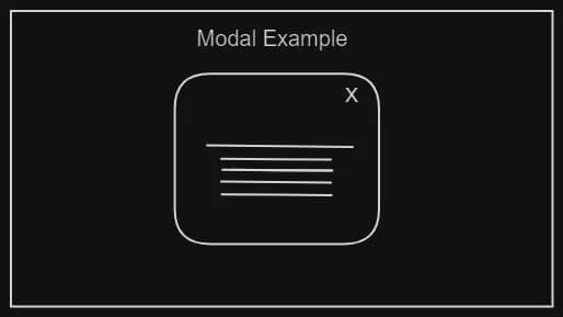
Another variant example of the layout component pattern is the modal wrapper. The idea around this is to have a flexible and reusable way of displaying any component as a modal, without being tightly coupled to its children.
All you need to do is simply wrap it around any component you want to call as a modal. In other words, you are creating the ability to be able to say: “Hey Modal! Can you show this component as a modal whenever I request it?”
You can see that the principle stays the same, right?
Take a look at the code below, utilizing the *styled-components* approach, (feel free to use any styling approach):
import styled from "styled-components";

const ModalBackground = styled.div`
  position: fixed;
  z-index: 1;
  left: 0;
  top: 0;
  width: 100%;
  height: 100%;
  overflow: auto;
  background-color: #99999b;
`;

const ModalBody = styled.div`
  background-color: #ffffff;
  margin: auto;
  padding: 1.2rem;
  width: 50%;
`;

export const Modal = ({ showModal, onClose, children }) => {
  return (
    <>
      {showModal ? (
        <ModalBackground onClick={onClose}>
          <ModalBody onClick={(event) => event.stopPropagation()}>
            <button onMouseDown={onClose}>Close Modal</button>
            {children}
          </ModalBody>
        </ModalBackground>
      ) : (
        false
      )}
    </>
  );
};
Here, the modal layout component is defined with the necessary styles needed to make it look like a modal. These styles are encapsulated in the component and reusable, this eliminates the burden of having to write styles for every modal you need.
The next part is the set of props which makes the modal operational, these include:
showModal— the boolean for toggling the modalonClose— the function for closing the modal on requestchildren— whatever component meant to be displayed as a modal
Consuming this modal layout component is pretty straightforward as all you need to do is wrap it around any component you intend to call on a modal:
// Any component to show as a modal on the UI
import { ComponentToShowAsModal } from "./ComponentToShowAsModal";
import { Modal } from "./Modal";

function HomePage() {
  const [showModal, setShowModal] = useState(false);

  return (
    <>
      <button onClick={() => setShowModal(true)}>Show Modal</button>
      <Modal showModal={showModal} onClose={() => setShowModal(false)}>
        <ComponentToShowAsModal />
      </Modal>
    </>
  );
}

export default HomePage;
Benefits
A good layout component maintains a distinction between itself and any children. This means a layout component can be changed or modified without affecting the behaviour or lifecycle of the child component.
A good layout component can display components at any scale within the app; whether at a page or sub-component level. From the example seen earlier, the layout component receives style props to enable it to dynamically adjust the layout structure based on passed values.
A good layout component offers a separation of structural and logical concerns; this pattern enables you to have a clear distinction between the shape or skeletal display of your entire UI and the actual content it displays. This will in turn increase the maintainability and readability of your codebase.
Use Cases
A good and common reason to utilize the layout component pattern is when you have certain components that are shared across multiple files and pages such as:
- the navigation bar, footer and side menu
- modals
- two or more components, each sharing major content
etcetera
❗ It is also important to note that only components that are not frequently updated (if ever), should be structured as a layout.
Conclusion
The layout component pattern is a basic but powerful way of organizing your user interface to provide room for a scalable and maintainable codebase. In addition, your app is faster and more performant since this pattern eliminates any unnecessary repetition of markup, and reduces the need for extra JavaScript and styling code.
Thank you for reading till the end, (I hope you did 😉), I write articles and make content for people who want to level up to senior engineers. Follow me on my social platforms and feel free to check out my other articles on my blog.
Happy building!